Get my free demo
One homepage, four directions

What "made good" looks like.

The before column below is the kind of site we see every week: built years ago, hard to read on a phone, service times buried three clicks deep, no way to plan a visit.

Before / after

Drag the handle. Same church, new front door.

A typical older homepage on the left, rebuilt on the right. The wording stays the church's own. The service times move from the fine print to the first screen.
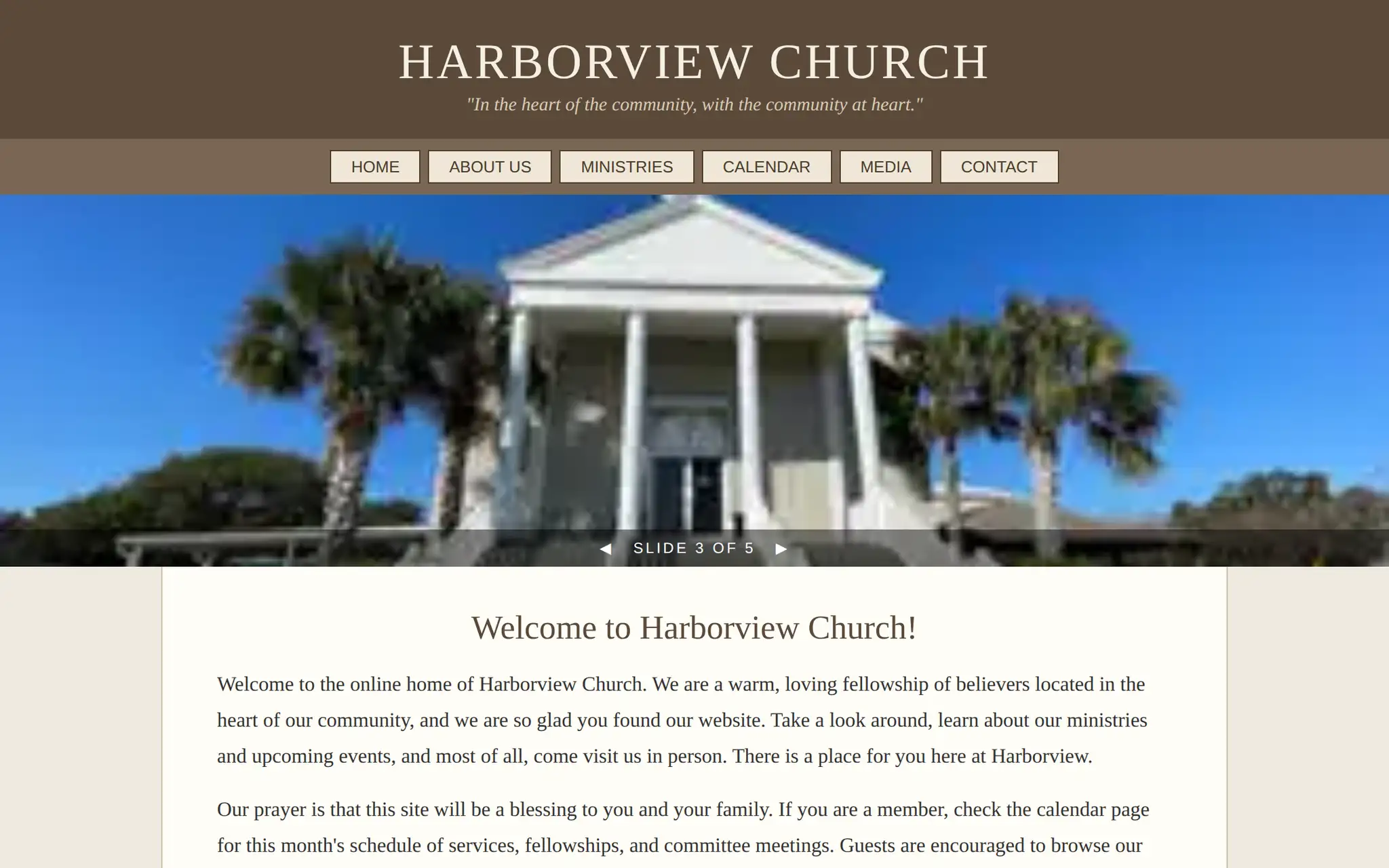
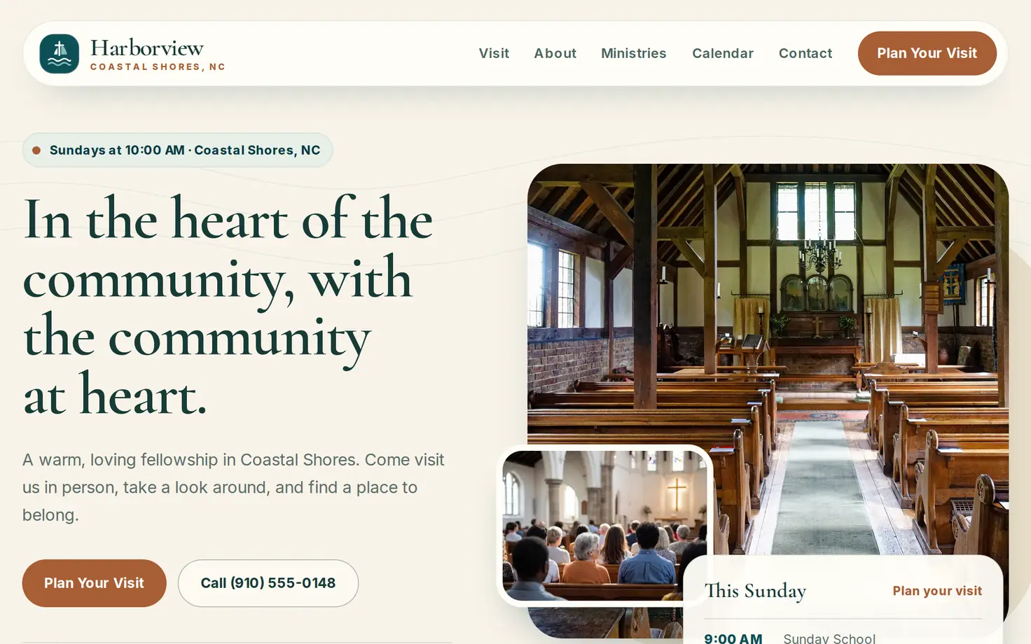
An older church homepage, with the service times in the footer The same church homepage rebuilt by Tov BeforeAfter
‹›

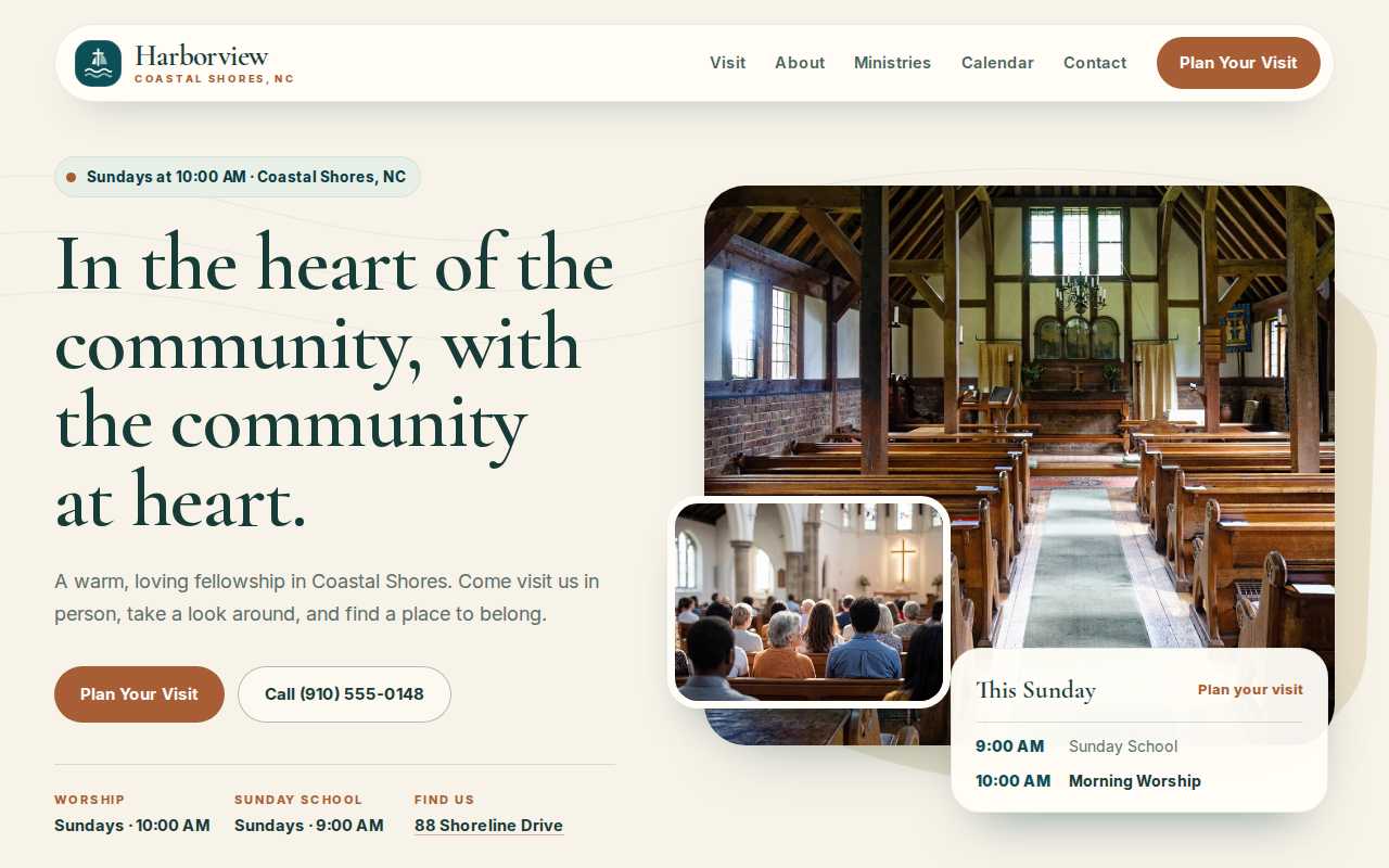
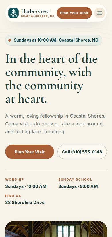
Harborview Church, in one of the directions we build in. Drag the handle, or focus it and use the arrow keys.

Before

  • The homepage opens with a slideshow and a welcome paragraph written for insiders.
  • Sunday times are on a subpage, and the site disagrees with the Facebook page about when worship starts.
  • The site does not fit a phone screen. Most first-time guests are on a phone.
  • There is no clear next step for someone new.
  • Google and AI search cannot tell what your church is, where it is, or when it meets, so you are missing from their answers.

After

  • The homepage answers three questions in the first screen: when do you meet, where are you, what should I do next.
  • Service times match everywhere, because we confirmed them with the church before launch.
  • Every page fits a phone. Guests can tap to get directions or plan a visit.
  • One clear next step: Plan Your Visit, in the navigation, the hero, and the footer.
  • Pages built so Google and AI search can read them: the times, the place, and the next step, stated clearly and the same way everywhere.
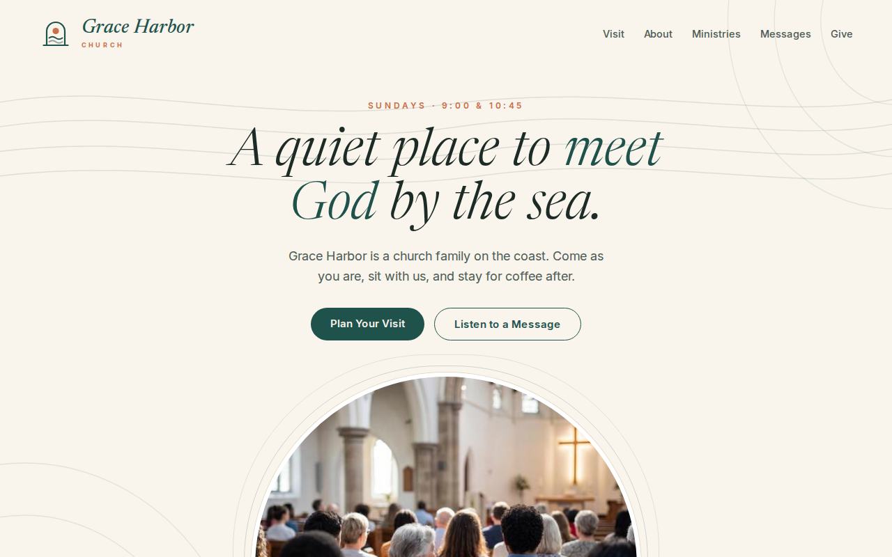
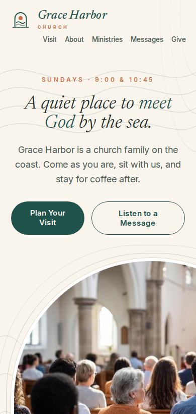
Homepage rebuild for Grace Harbor, a coastal church, soft calm design

Grace Harbor

Coastal church · Soft, calm direction

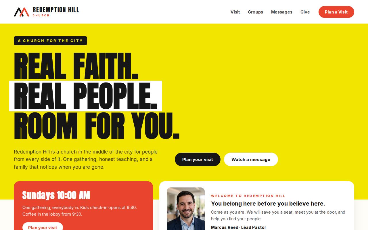
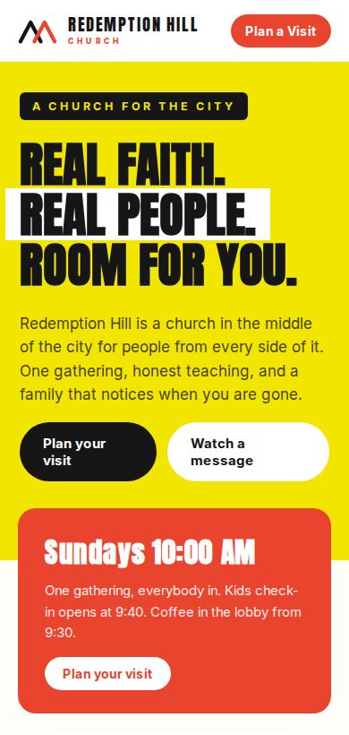
Homepage rebuild for Redemption Hill, a city church, bold modern design

Redemption Hill

City church · Bold, modern direction

Homepage rebuild for Harborview Church, warm minimal coastal design

Harborview Church

Coastal church · Warm, minimal direction
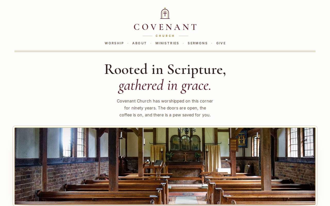
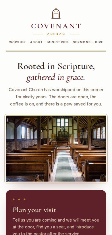
Homepage rebuild for Covenant Church, classic traditional design

Covenant Church

Traditional church · Classic, warm direction

What changed and why

Design, structure, and the path a guest takes. What never changed: their wording, their beliefs, their name, their times, their logo. If it was not true about the church, it did not go on the site.
Get my free demo for your church